Product Release Series – October 2021 Honorable Mentions
In this Product Release Series post, we’ll cover the honorable mentions for our front and back office releases in October, including improvements to our CRM, Relocation, Digital Marketing, and eSign solutions. These updates were released to production on October 19, 2021.
It’s almost November, which means it’s nearly time to turn back the clocks in much of the country and settle into what’s often a slower business period for many brokerages. The less hectic winter months are the perfect time to plan some team building activities, train your agents on a new tool, and strategize the best ways to reach your 2022 business goals.
- Constellation1 CRM with mobile app
- Constellation1 Relocation
- Paradym by Constellation1 Digital Marketing Suite
- Constellation1 eSign – electronic signatures for any industry
At Constellation1, our goal is to make your front office tools better so you can do more with your tech and boost your brokerage’s revenue. We’re continuously working to improve our solutions so they don’t just meet your expectations, they exceed them.
Constellation1 CRM with mobile app
We’re constantly making improvements to help you capture and convert leads more easily.
Group module improvements
We’re frequently implementing our customers’ feedback. We’ve made the groups module in our CRM easier to use and navigate. Now you can click on a name to go directly to the contact’s details page when viewing leads and clients in a group.
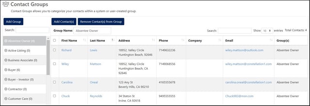
Pro Tip: You can right-click on a contact’s name to open their detail page in a new tab or window. That way, you can work on your lead individually and navigate back to the group quickly and easily by simply closing the new tab or window.
Left navigation improvements
The left navigation menu is the easiest way to access all the different features of the CRM. By default, it’s collapsed for a more compact view. You can easily expand the menu by simply clicking the arrow at the bottom.
In the past, the CRM would automatically reset to the collapsed view. Now, for a more consistent user experience, the menu will remember your previous selection as the default while navigating around the CRM.

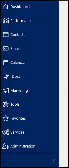 The collapsed and expanded navigation menus.
New address types for mobile
With this release, we’ve incorporated new address types into the mobile app to give you more flexibility and trackable data points.
You now have access to the following new address types:
|
|
Constellation1 Relocation
Is your brokerage leveraging the power of relocation referrals? We’re always working to make our solution even more powerful for your team. In this release, we’ve improved loading times and made several additional enhancements. Read more below.
Navigation and usability updates
We’ve been working to make value-added updates that make Relocation easier to use while boosting your efficiency.
Forgotten passwords
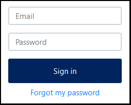
We’ve added a link on the login screen where users can recover a forgotten password.
After clicking “Forgot my password,” users are prompted to enter their login email address. Then the system will send a temporary password that allows users to log in and reset their password.
Improved Save functionality
We’ve improved the workflow for saving client records. Previously, you’d be taken to a separate confirmation screen where you had to click OK to return to the client record. Now, the system simply saves the record without a separate screen. A momentary save confirmation will display in the top-right corner to let you know the save was successful while you continue working.
Updated ZIP Code label
To better serve our US- and Canada-based customs, we’ve updated the label on the “ZIP Code” field to now read “Postal Code.”  The field will continue to support both US and Canadian postal code formats (e.g., 12345 or A1B 2C3).
Response status
We’ve clarified the message in the Response Status field for the client record. Previously, the text read “Overdue for X hours.” We have updated the message to now say “Awaiting response for X hours.” After waiting for a response for more than 72 hours, the message will then display as “Overdue.”
Applying advanced filters
Filters help you find the information you need faster. We’ve improved the visual feedback alerting users that advanced filters have been applied to a particular list by including a splash screen that will display momentarily once a filter or filters have been applied.
We’ve also made advanced filters sticky: if you’ve applied filters, then navigate to a client detail page before returning to the searchable client page, the previous filter selection will remain. Click the Reset button to clear the selected filters.
Navigation buttons on the Client Record page
We’ve made it easier to navigate between client records by adding Next and Previous buttons. When you mouse over either button, a bubble will display information about the next or previous client. You no longer need to go back to the client list to select the next client record to view or update.
Adding emails to Closed records
Tracking emails is one of the most important aspects of relocation management. In some cases, you might need to attach email communications to closed records, a feature we didn’t previously support. Now, clients with a closed status are included in the Select Client by Last Name dropdown in the email responses list.
Select the client, and the email will be attached to the closed record.
Simplified closing calculations
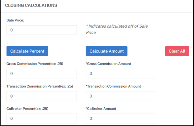
Another one of the most important aspects of relocation payment is making sure you get paid accurately! It’s an advantage when the system can do this for you, but sometimes you might want to clear those calculations and adjust them yourself. We’ve added the ability to do this quickly and easily to the closing calculation section.
Now there is a Clear All button in this section that will clear all pre-populated numbers and data from the fields. The only exceptions are the Referral Fee fields:
|
|
These fields will remain populated.
Paradym by Constellation1 Digital Marketing Suite
The touchless digital marketing tools you need to fill your funnel and take tedious social media management off your agents’ plates is getting even better!
New listing Preview Videos
In our previous release, we introduced the first phase of our new Preview Videos, short 15-second videos created as part of a new property tour. In this release, we are adding more features and functionality as part of phase two.
- Brokers and agents now have full access to all Preview Video features and can decide whether or not to enable them.
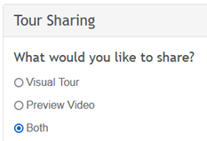
- Preview videos can now automatically be posted to Facebook, Twitter, LinkedIn and YouTube. We have added a new field to each social connection that will allow you to determine if you want to share Visual Tours, Preview Videos, or both.
- Smart Comments have also been updated to include comments that are specific to Preview Videos. Smart Comments will enhance the reach and value of not only your preview video, but all your posts! Smart Comments are predefined comments that are added to the comments section of your social posts.
Reestablishing broken social media account connections
You count on our tool to maintain connections to your linked social media accounts so your sphere never misses a post. However, sometimes these connections can fail or expire. Now when this happens, the system will automatically attempt to reconnect to your account. If successful, your posts will continue as scheduled and you won’t have to do a thing!
If the system is unable to reestablish the connection, you’ll receive an email notifying you the connection has expired so that you can reestablish it manually and avoid an interruption in your posting schedule. These emails will be sent weekly until the connection is either reestablished or removed from your account.
Constellation1 eSign – electronic signatures for any industry
Electronic signatures are a powerful tool for staying connected and keeping your business going, no matter where you are! We’ve made our eSign tool even better with lots of updates this release.
Updated Next button behavior
While signing a document electronically, the Next button has proven to be a valuable tool to guide the signer through the signing session. We have made significant improvements to the behavior of our Next button so that eSign is even easier to use, providing a smoother user experience for both desktop and mobile signing sessions.
Zoom level on a mobile device
When using a mobile device during a signing session, if the signer zooms in on the document, then taps Next to go to the next markup, the document will remain at the current zoom level showing the markup or tag, instead of returning to the default zoom level. This makes signing sessions easier to navigate.
Next button floating in the left margin
During a signing session, the Next button will now float in the left margin of the document. When the signer taps or clicks the Next button, it will stop on the line where the next markup tag needs the signer’s attention. This minimizes confusion by reducing the amount of jumping around within a document.
Scrolling through a document
When a signer scrolls through a document, the “Next” button will remain in the same location on-screen. This gives the signer the opportunity to read through a document at the beginning of a signing session. When ready, the signer can click the “Next” button to be taken to the next markup. The signer still needs to tap or click the “Next” button to close a signing session. If any markups have been missed, the signer will be taken to that location before ending the session.
Markups and tags needing attention
We’ve also improved the visibility of markups and tags that are currently active and need attention. The selected markup will now have a glow around it to make it easier for the signer to see and interact with.
These new behaviors are designed to minimize confusion and make the “Next” button as static on-screen as possible, resulting in a smooth and effortless user experience during a signing session.
System update
We’re always looking to improve user experience for our products. With this update, we’ve made changes to the eSign system that improve response times when working with templates.
Continuous updates to serve you better
At Constellation1, we’re continuously working to improve our solutions so they don’t just meet your expectations, they exceed them. Subscribe to our blog and check back here next month for November’s honorable mentions.
If you have any questions about this release or any of our product features, get in touch with us today.
If you missed our last product release post, you can read it here.
United States:
©2025 Constellation Web Solutions, Inc | All Rights Reserved | Privacy Policy | Terms | Do Not Sell My Information


